Books: Keep or Toss (Vol 2)

I use the term Booktoss as a way to communicate to the Literary Gatekeepers (read that as adults with money to spend on books) that we need to be willing to see the problems with books and toss some of them aside. There are always books I want to keep, and hold, and reread, and share. Those are the ones I pass along to parents, teachers, librarians, and most importantly children. Books that provide authentic views of lives and people and events. Books that are complex, complicated, heartfelt and heartening. Because there are authors who don’t find it necessary to tear down, dehumanize, objectify, or rely on tired stereotypes about mis- or under-communities for their books.


NotYourPrincess_Cover#NotYourPrincess:
Voices of Native American Women

Edited by Lisa Charleyboy and Mary Beth Leatherdale, published by Annick Press

This book is a collection of poetry, essays, and interviews, as well as visuals that include photos, paintings, and collages. Each page or two brings another voice, another  face, another story to the reader.

This is marketed as a YA collection and I think that makes sense for the content. Authors take on many facets of being Indigenous women with an unflinching gaze at the rest of society. At times the images and stories were hard to read, some were funny, some showed a wariness, while others illuminated a way of being and seeing the world. The essays and poetry were fairly easy to read which makes this a great collection to give to older struggling readers and ESL readers.

I did look up the Lexile rating for the book and was surprised to see it set at 910, which loosely translates, to a sixth grade reading level. Remember, reading levels have NOTHING to do with the content, nor with images. They only measure word, sentence and paragraph length, punctuation, and familiarity of words used. My own estimate would have put this collection around a 3rd or 4th grade level, so I was surprised by Lexile’s measure. One reason may be the formatting and grammar in the poetry might be skewing the measure. Another reason may be the use of tribal names such as “Dane Zaa/Cree” (p. 43), and “Haudenosaunee” (p. 65), and even the use of indigenous languages.

Should that affect the reading level? I am not sure. I must admit that as a reader who is unfamiliar with many of the Nations and languages in the collection I had to make a choice – to take the words as they came and assign little meaning to them, or to take the time to look them up, make note, try to understand the regions, tribes, nations and history. I choose the latter and I believe the reading experience was better for it.

This is truly a multimodel text. The images are integral to this collection. They are not separate from the words. Instead, both interact in familiar ways and I found myself using the same kinds of strategies and skills I use to read graphic novels. Many of the photos feature Indigenous women looking directly at the reader, along with narratives that directly address the reader, thus breaking the 4th wall. This is a powerful choice to make, to draw the reader in and now allow the comfort of detachment.

The book can be found here, at Annick Press. I plan on using it in my children’s literature class to show the kinds of poetry that abounds today and to help my students learn the skills they need to read across cultures.

Buy #NotYourPrinces. Support #OwnVoices.

What Are You Reading? December 29, 2014

Mon Reading Button PB to YA

I’ve been thinking about simplicity lately. The idea that an image can be simple but not easy has grabbed my attention.

The difference between simple and complex isn’t easy to understand. This is one reason why text leveling does not work for measuring the difficulty of a text. Text leveling measures what it is designed to measure – the length of words, sentences, and paragraphs; the commonality of words and punctuation used to construct the sentences. Text leveling programs measure these factors accurately, but what these measures miss is what I have begun referring to as the “cognitive-aesthetic” work that readers do when reading. That is why Hemingway ‘s  The Sun Also Rises has a lower Lexile score than Atwater’s Mr. Popper’s Penguins (read the New Republic’s article here) that means Hemingway’s language might be simpler but the story is not.

The issue is NOT that the measures are wrong, it is that they are being used incorrectly. It is as if I asked for a vegetable peeler and got a hammer. The hammer is designed to do a job, and in the right hands it can do those jobs well. But take a hammer to a ripe mango and all you have is a big mess and that is what these measures are doing for classroom reading – making a giant mess.

And, when utilized on graphic novels, comics and even informational books with an abundance of images, things go very wrong, very quickly.

And so I have been thinking about cognitive-aesthetic comprehension. I began looking at books that express great emotions – an abstract and complex construct – with little detail and little or no color.

Happypigeon

depressed pigeonMo Willems is an expert on the use of muted colors, simple lines, and few details to convey great emotional range and depth in a character. How else can he take us from a happy-go-lucky Pigeon to a despondent Pigeon? Willems changes the “pupil” location, the neck, the tail, and the wings. We, the reader, read into these changes and interpret the emotional context of the character.

Andy RWorried_owlyunton shows us a depressed and worried Owly by manipulating similar aspects of the bird – especially the eyes. Using the same downcast pupils in large, white orbits he is cueing the reader to interpret worry or sadness or, even, depression.

But what about artists who don’t use these kinds of large, rounded eyes? How do they provide the reader with cues to the emotional life of a character?

Veil_persepolisMarjane Satrapi’s memoir Persepolis uses deceptively simple, solidly inked illustrations. Typical of the book is this illustration of Marjane and her friends as they are made to wear veils for the first time in their lives. Satrapi provides the reader with a view of the changing world these girls are experiencing during Iran’s religious revolution. She uses a few details to delineate girls from one another, including their eyes, a bit of hair on the forehead, and a single line for the mouth and yet we see a range of emotions from comfort or acceptance to worry and resignation.

Keaton_face_BlufftonIn Bluffton, Matt Phelan gives us a character who is known for his deadpan expression. Buster Keaton’s youthful face is shown with almost no expressive lines, slightly raised eyebrows, and like Satrapi’s young girls, a single line for a mouth. But, somehow I look at that face and wonder at the depth of character that is going on behind those eyes.

The lack of color is not the most striking aspect of these images – instead it is the abstractness that I actually forget about. Even without color and in only two dimensions, the human face is a complex set of lines and angles.

Dorothea Lange_Mother

Dorothea Lange’s photos capture the depth of human emotions without the use of color, as in her famous photo Migrant Mother, Nipomo, California. Although we have to work to comprehend the emotions the photo is a realistic depiction of a human face rendered into a two-dimensional image.

What amazes me, as a reader and a scholar, is the ways highly abstract faces emote such strong responses without the details that would make them realistic.

The Pigeons happiness and sadness is obvious. Keaton’s emotionless face gives away nothing and yet I interpret it as having much to reveal if only given a chance. This use of highly abstract images can create characters that we as readers work to understand. But, and this is the part I am still thinking about, why are we compelled to do that work? The work the reader undertakes – to interpret a simple set of lines into a meaning of emotion, thought, an personality – is not easy and in fact the work is often far from frivolous.

maus

From Art Spiegelman’s Maus

Harlem Hell Fighters

From Harlem Hellfighters by Max Brooks and Caanan White

Binky series by Ashley Spires

I was off to a good start with this blog. It felt good to put my heard-learned knowledge to something that might be useful to actual teachers. I was getting good feedback, from colleagues and from perfectly nice strangers. All of the things bloggers want.

And then someone asked me what, I am sure, she considered a perfectly innocent question, “Do you think having the irregularity of thought bubbles, action balloons, overlapping panels and other non-traditional print characteristics is OK for kids just beginning to learn to read?” And I had to say, “umn, I don’t know.”

I have to say that a lot when literacy people start asking very good questions, as they are want to do. The reason I say “I don’t know” so often is because there is not a lot of research on the cognitive activity involved in reading graphic novels and comics.

There is one thing that I can say. More and more emphasis on younger and younger children reading and gleaning information from non-narrative, informational texts means we had better figure this stuff out. The Common Core State Standards don’t call for reading graphic novels until the 5th grade and then they drop off the CCSS around grade 7. I can’t explain that either.

Owly: A Time to be Brave by Andy Runton

Owly: A Time to be Brave by Andy Runton

I went in search of graphic novels for young readers. I love the Owly series by Andy Runton. It is a  fabulous wordless stories.

But  I wanted to know what was available for readers who are just getting their feet wet and working towards  print automaticity – when reading means following the expected pattern of  left to right and top to bottom  that English requires.

I went to my local library, talked to one librarian who was not at all interested in me or my work because he “just doesn’t get that whole comics thing”.  I went to another librarian, she had some suggestions but I think she got them directly from The HornBook, which means she is reading trade journals about graphic novels, but not the actual books. I can say that because she responded to my questions with, “Yeah, I don’t actually read them”.

Then I saw a kid perusing the graphic novel shelves. I watched him for a while. He was opening books, flipping through them, pausing and putting them back.  He put  Cardboard on his stack, put back a couple of books that weren’t very good, paused to read a good chunk of Foiled by Jane Yolan and Mike Cavallero, then he put both Foiled and Foiled Again on his stack to be checked out. A women, who turned out to be his mom, came by and asked if he was ready to go. I took my chance and asked her if it was Ok if I talked to her son, I handed her my official looking Boston University business card, and gave her my 30 second dissertation explanation. She said sure and stood near us, which was fine by me.

Harold, I’ll call him Harold because he looks nothing like a kid named Harold, is 12. I chatted with him for a few minutes. He’s been reading graphic novels for a while. He’s a DC man and likes a lot of the reboot, especially the new Spider Man. He’s not too keen on Batman. We talked graphic novels, I suggested a few, especially the Olympians series by George O’Connor. We established mutual credibility and I moved on to what I really needed advise about.

Turns out Greg (He really wasn’t a Harold) liked being asked for help by an adult with a business card (I gave him one, too). After I explained what I was looking for, he pointed out the BINKY series by Ashley Spires, published by Kids Can Press. I got way too excited and geeky and started talking about publishers, Scaredy Squirrel (aslo published by Kids Can Press), fonts and white space. My cool-adult cred was totally blown and Hank (I really should have asked his name) and his mom took off.

SpaceCat

I checked out all the Binky books (I found 4, there is a 5th coming out in September), and read them several times. I like them a lot. They appeal to my sense of the absurdity of taking oneself  seriously.

Binky The Space Cat, page 35

Binky The Space Cat, page 35

Plus, there are fart jokes.

Binky is a house cat who is in charge of protecting his space station (the house) from aliens (all manner of flying and stinging bugs). The books have a great dual narrative (much like the Bad Kitty books by Nick Bruel). Binky’s space station narrative, in which he is a highly trained member of F.U.R.S.T (Felines of the Universe Ready for Space Travel) stand in sharp contract to the reality that the readers understands, in which  Binky is a total nut-job of a cat.

Binky concludes

Binky the Space Cat, page 25

The illustrations work on these levels perfectly, allowing the reader to understand the cues Binky uses to come to the completely wrong conclusion about the world. Also, did I mention the fart jokes?

In general the regularity of the panels, and the action oriented transitions work to provide scaffolding of the sequencing of the story for young readers. In addition, the colors are mostly muted with small dashes of vibrant color.

But, and there is always a but, I don’t think the reading level, the actual written words on the page, are designed for young readers. I wanted to see what others thought about Binky’s reading level and soon discovered that no one has developed a good measure of graphic novel reading levels (and there is another project).

Here is what the experts say about Binky’s reading levels. The thing is, these reading levels (including the Lexiles) range from grade 1 to grade 5, which is a wide range!

Title

Lexile Level

Fountas & Pinnell

Grade level

Grade*

Age Range*

Binky The Space Cat (2009)

GN740L

N

3

2-5

7-10

Binky To The Rescue (2010)

GN360L

N

3

2-5

7-10

Binky Under Pressure (2011)

GN240L

N

3

2-5

7-10

Binky Takes Charge (2012)

GN560L

N

3

2-5

7-10

Binky License to Scratch (September 1, 2013)

GN400L

NA

NA

2-5

7-10

From Kids Can Press website (http://www.kidscanpress.com)

There are many complex words and phrases like “collecting specimens” (Binky to The Rescue, p. 19) and “caught unlawfully reading” (Binky The Space Cat, p. 5). I wonder how many 5 year olds could figure out those phrases.

I want to return to the question that began this post. What about graphic novels for very young readers? Do these books help? Do they hinder? And, again, I have to say I don’t know. I know there are lots of lots of questions left to answer. I’ve been thinking about how to develop a measure or rubric or system to communicate reading levels but … I don’t know.

BinkyRescue

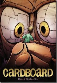
Cardboard by Doug Tennapel

Cardboard Cover

One of the issues teachers face when trying to integrate graphic novels into the classroom is a lack of general knowledge about the medium. Some interesting research shows that teachers want to use these books but do not know enough about how to read comics in general or how to evaluate graphic novels in particular (see Thomas DeVere Wolsey’s blog).

Although I started this blog with SUMO, I must admit it is not a great book for novice graphic novel readers. On the other hand, Cardboard by Doug TenNapel is a great graphic novel to start your exploration of the media. TenNapel is the author of other works such as Ghostopolis and Power Up (you might see a resemblance between Mike, the father in Cardboard and Hugh the protagonist in Power Up).

What makes Cardboard a great  graphic novel for novice readers is something I call alignment. The words and images in graphic novels should support each other and push each other to make a greater whole than either one or the other is capable of on it’s own. When images and words are closely aligned, they support each other without pushing too many boundaries. When the alignment is irregular, disturbed, or even completely disconnected (in works such as V for Vendetta by Alan Moore and David Lloydor, or American Born Chinese by Gene Luen Yang) the works are more complex and difficult to read and understand. For some books,the complexity of story, words, and images makes for genius, but that may not be where you want to start.

One metaphor I have been playing with for understanding how words and pictures work together is that of constructing a house. You can think of the words as the framing of the room. What shape does it take? Are there lots of windows or just a few? Are the ceilings vaulted? The words  provide the structure for the story. Then there are the  images, which make up  the walls, floors, paint, carpet and furniture that give you a sense of what the room should be used for and for whom it was constructed. You can have the frame or the finishes, but you need both to have a room.

Cardboard uses a rich but straightforward palette of warm tans and browns that provide a kind of  comfort, even when people and cardboard monsters are at war – but I’m getting ahead of myself and the story.

Cardboard pagesMike is a construction worker who is out of work. He’s also a father, a very bad cook, and a widow. He has no job, no wife, no support of any kind but he does have a great kid, Cameron.

Cam_Close upThe novel begins on Cam’s birthday with Mike realizing he doesn’t have a dollar to his name for a present. He ends up buying a big cardboard box from roadside toy stand for 79 cents (yeah, people in stories actually stop at those stands). Turns out the big cardboard box is full of magic or alien technology or space voodoo and one thing leads to another – including the creation of a cardboard-come-to-life boxer named Bill, Cam’s arch nemesis, Marcus, stealing the technology to make more magic/alien/voodoo cardboard which of course leads to an evil cardboard King Marcus attempting to take over the world, or at least the neighborhood.

The story is fast paced with Good and Evil clearly demarcated with a sprinkling of personal redemption. Best of all everything, literally, works together to solve the problems that come alone (and alive) int eh story. The coherent narrative is a pleasurable experience with just enough creep-factor to keep it from edging into a  moralistic contrivance. TenNapel’s drawings are closely aligned with the words giving the reader a good story. The people looks like people, the rats look like rats, but when they combine, they look awesome!cardboard3TenNapel’s use of a connected color palette full of tans and browns, along with his consistent use of regular paneling that only breaks in times of high stress. There are  brilliant/gross touches throughout- such as when Marcus’s best friend Pink Eye defends himself by giving a one eyed cardboard monster an instantaneous and massively nasty case of conjunctivitis. There is references to body functions (including cardboard blood, a beating cardboard heart, and cardboard spit). All of this combines for a solid story where the images and the words support each other.